Sentra
Sentra is a cybersecurity company specializing in cloud data security, helping enterprises protect sensitive information across multi-cloud and SaaS environments. Its AI-driven platform discovers, classifies, and secures data at scale, giving companies clear visibility and control.
Digital
UX Research
UX Design
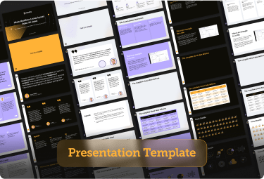
UI Design
Challenge
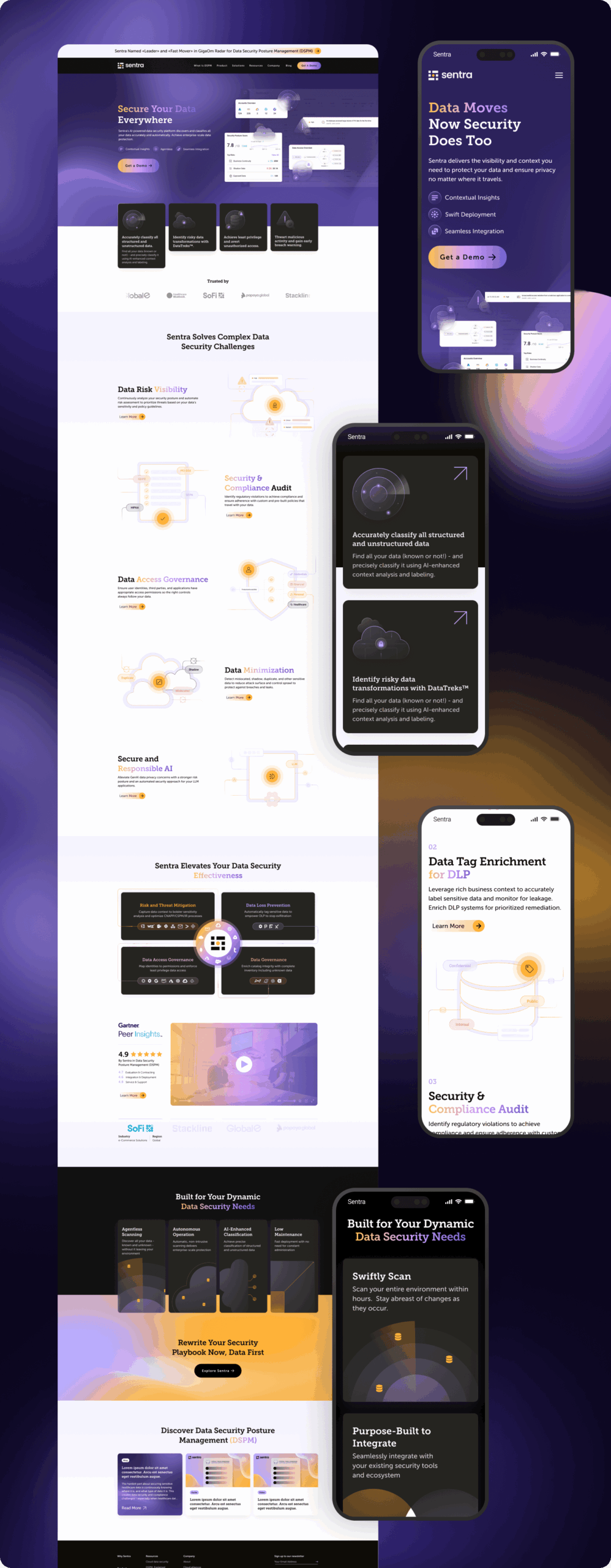
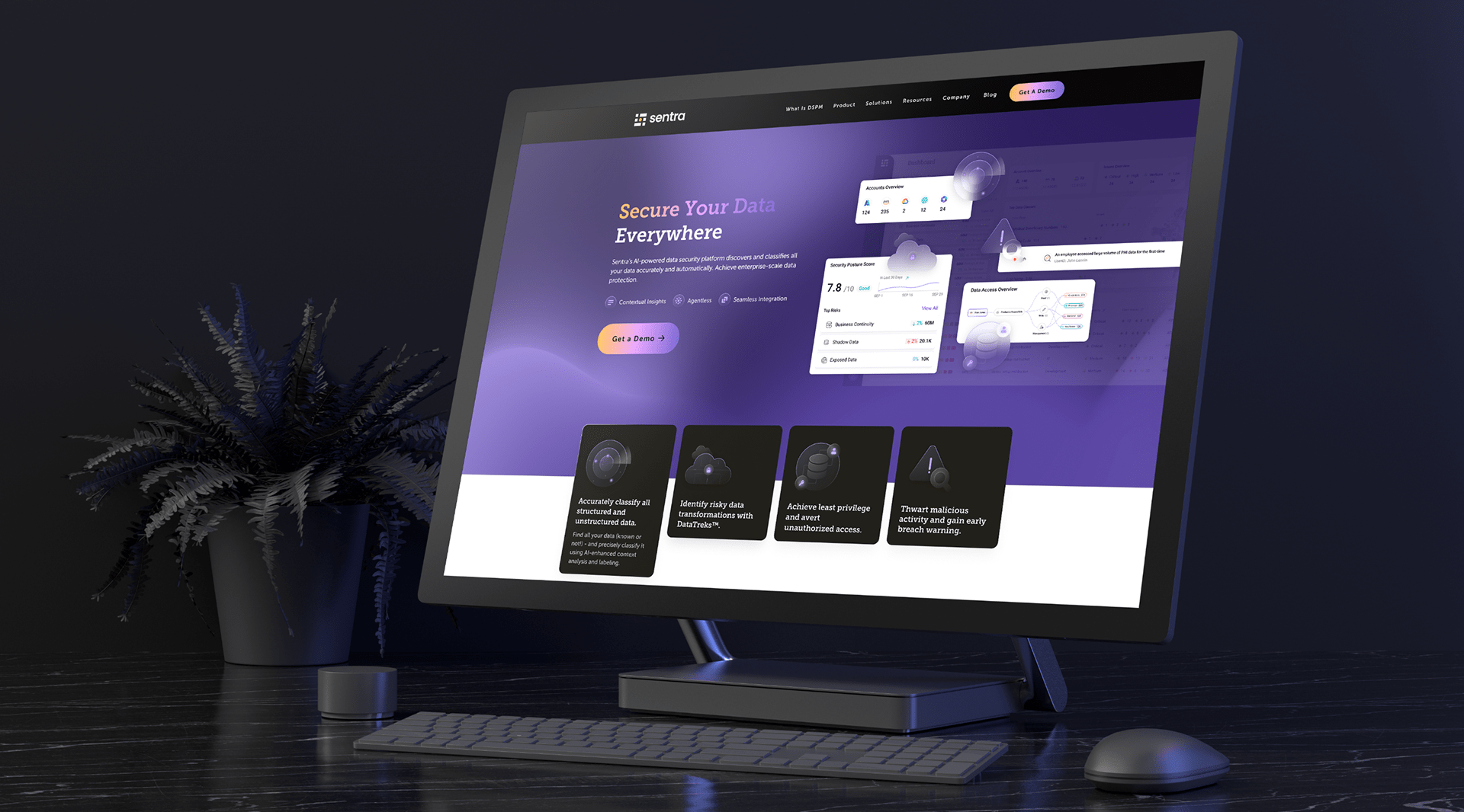
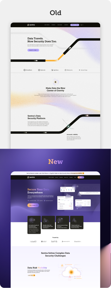
The company’s existing website, built on an outdated brand language, no longer aligned with its evolving vision and strategic goals and no longer drove engagement or conversions. Despite strong market recognition, the site felt antiquated and failed to communicate the company’s innovative direction. Leadership requested a complete website overhaul: a fresh, forward‑thinking design paired with strategically relevant content to support their updated brand strategy.
Solution
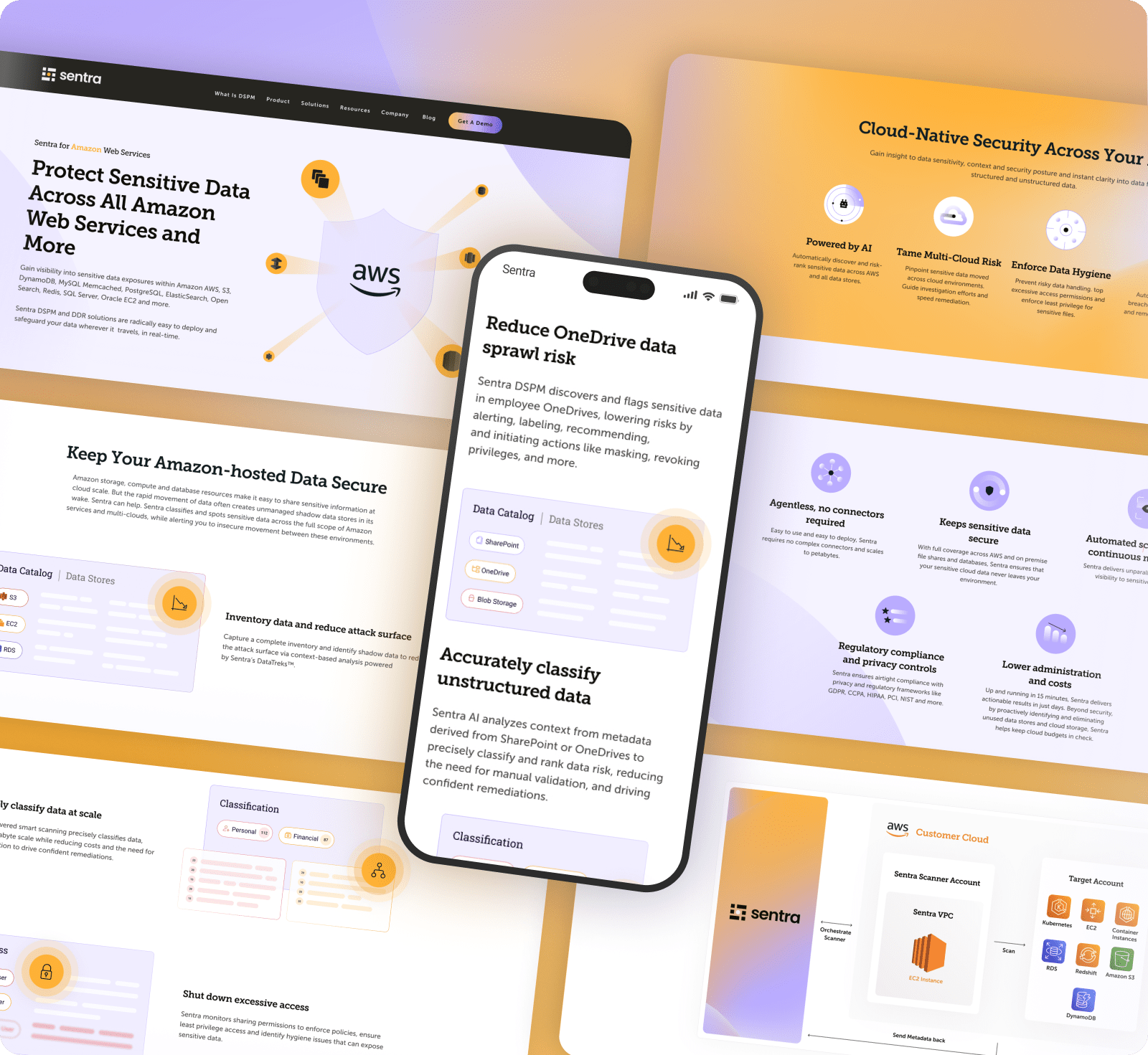
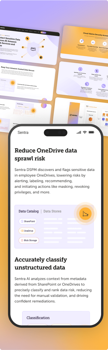
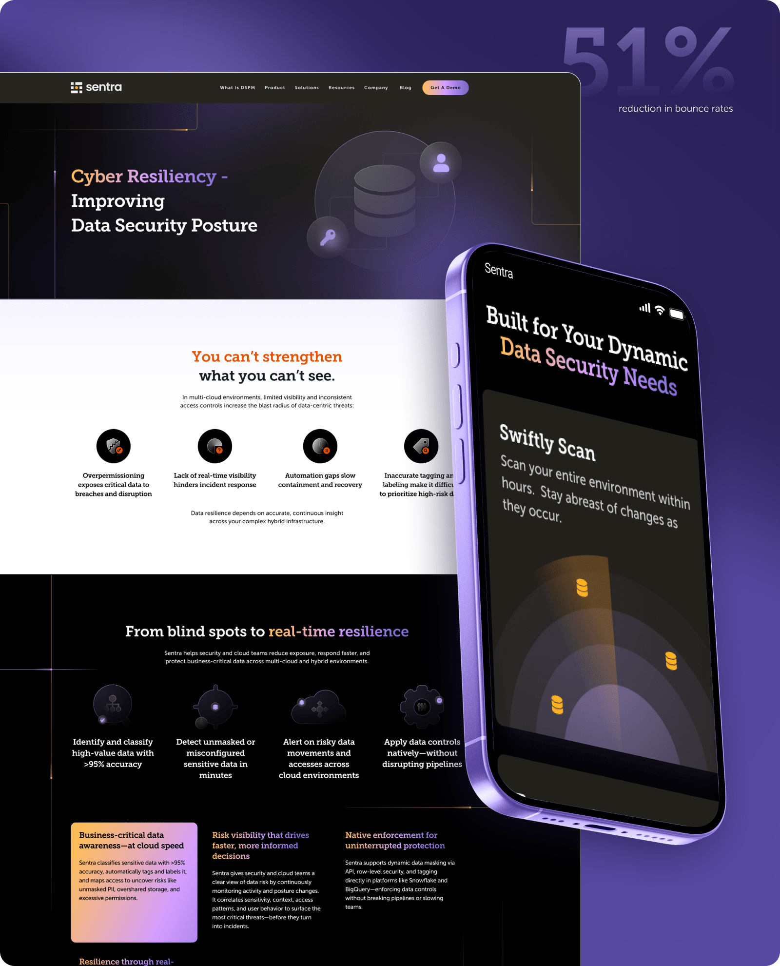
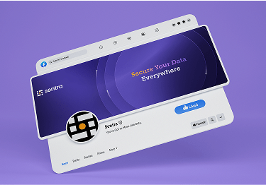
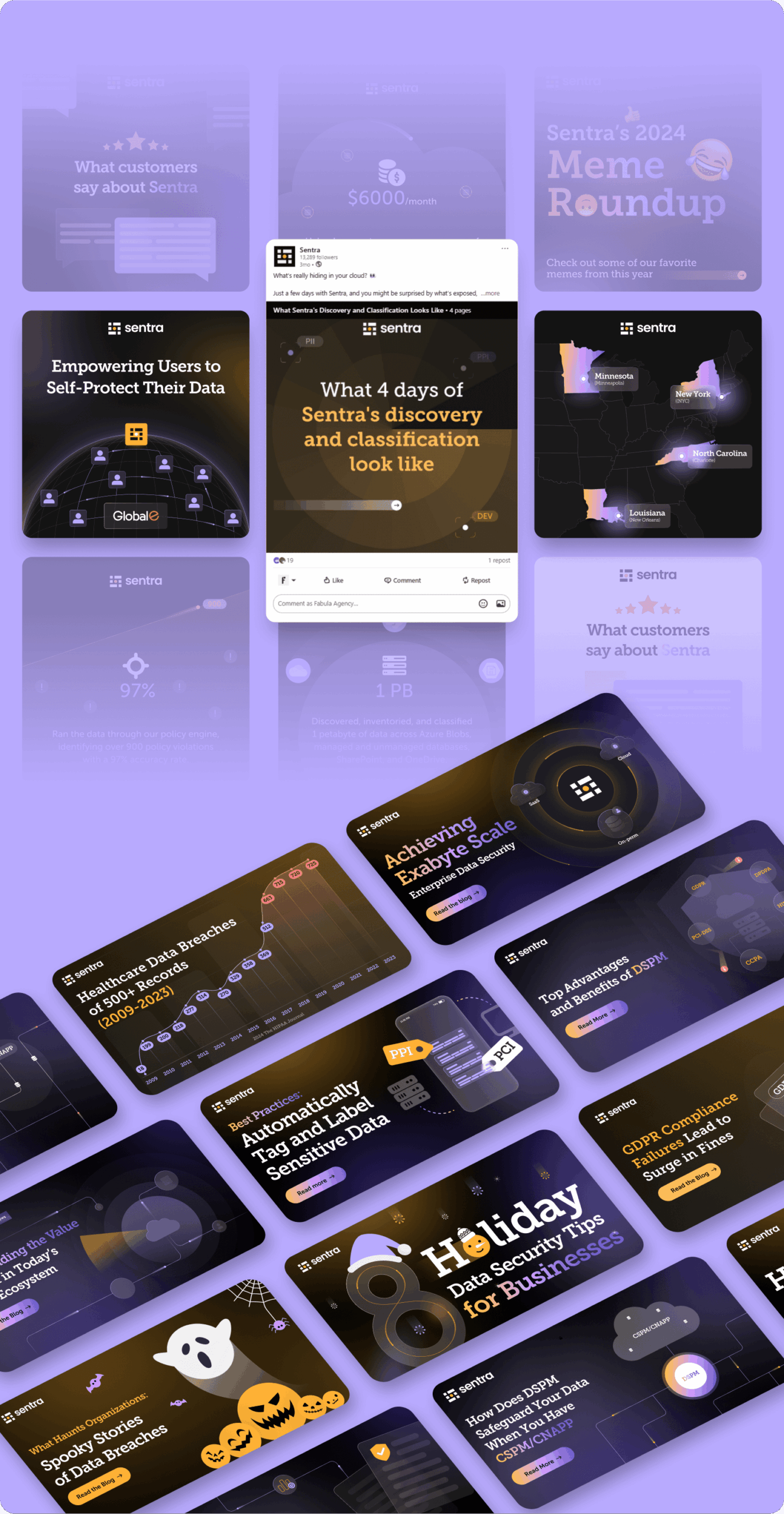
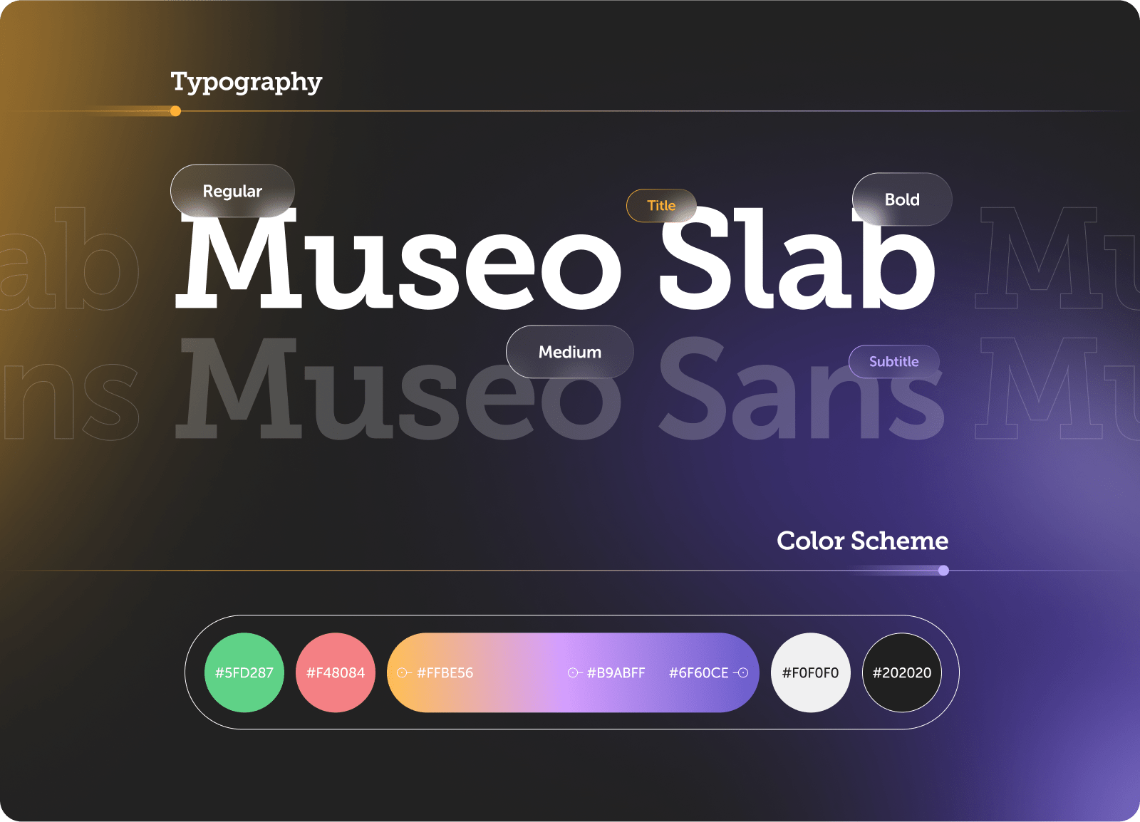
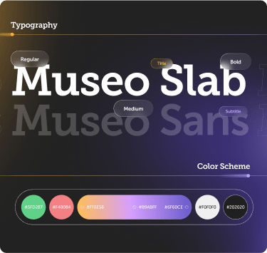
We conducted a deep review of Sentra’s positioning and market narrative, then created a website that combines: Modern, clean design with brand‑forward layouts and refined typography. Content aligned with the new strategy, highlighting AI‑driven security, threat detection, and compliance capabilities. Consistent tone and clear structure across all pages, ensuring a user‑first experience that communicates Sentra’s strengths and innovation.
Outcome
The redesigned site now positions the brand as both progressive and authoritative, reflecting Sentra’s market‑leading status. It communicates innovation without sacrificing familiarity, delivering clarity, confidence, and engagement—fully aligned with the company’s refined strategic narrative.
The company’s existing website, built on an outdated brand language, no longer aligned with its evolving vision and strategic goals and no longer drove engagement or conversions. Despite strong market recognition, the site felt antiquated and failed to communicate the company’s innovative direction. Leadership requested a complete website overhaul: a fresh, forward‑thinking design paired with strategically relevant content to support their updated brand strategy.
Solution
We conducted a deep review of Sentra’s positioning and market narrative, then created a website that combines: Modern, clean design with brand‑forward layouts and refined typography. Content aligned with the new strategy, highlighting AI‑driven security, threat detection, and compliance capabilities. Consistent tone and clear structure across all pages, ensuring a user‑first experience that communicates Sentra’s strengths and innovation.
Outcome
The redesigned site now positions the brand as both progressive and authoritative, reflecting Sentra’s market‑leading status. It communicates innovation without sacrificing familiarity, delivering clarity, confidence, and engagement—fully aligned with the company’s refined strategic narrative.
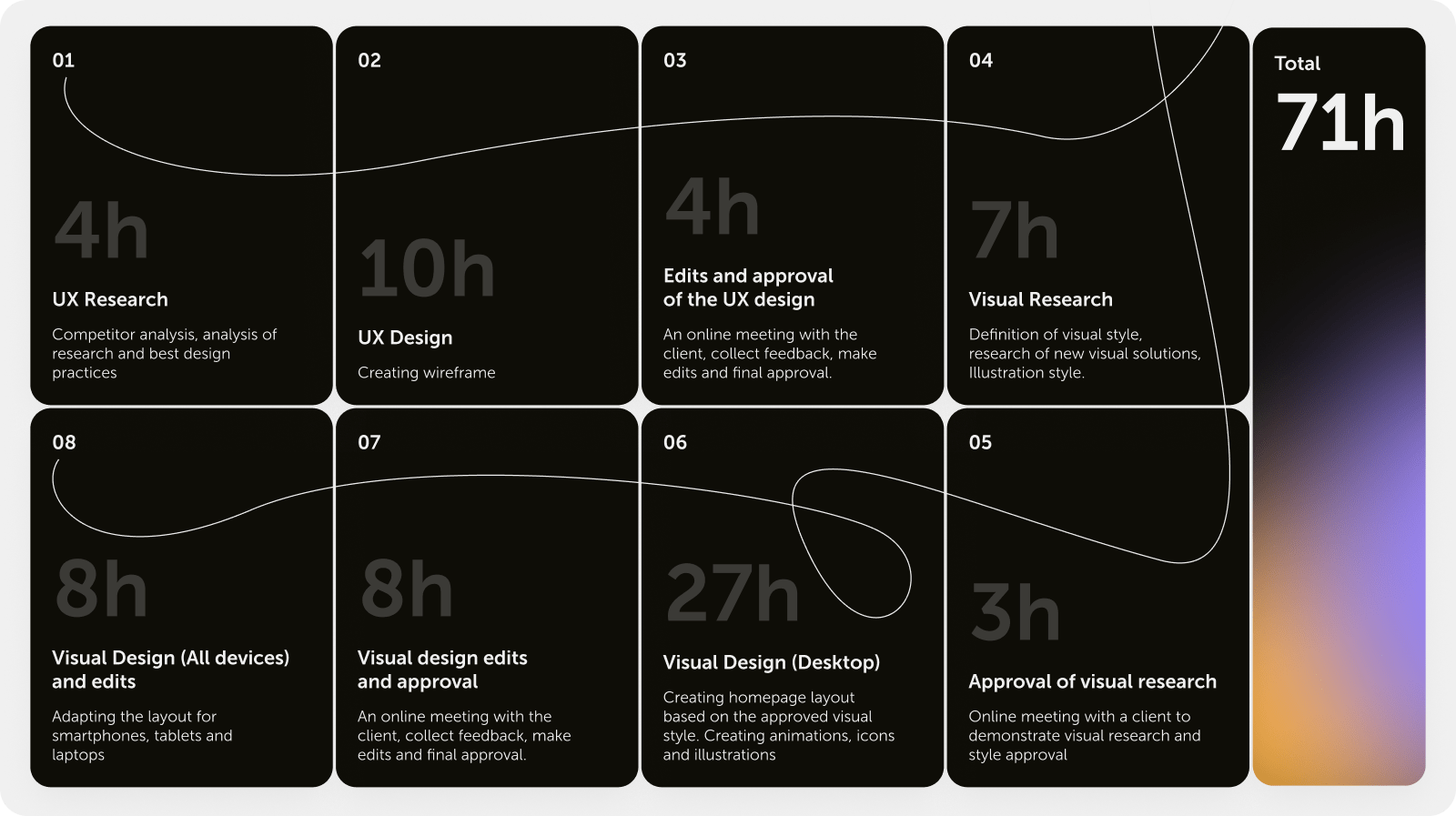
To align expectations and budgets, we created a precise timeline for the entire redesign process. This structured approach helped synchronize both teams and kept the project on track, ensuring there were no surprises in terms of scope, cost, or deadlines.
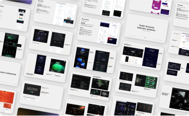
We conducted a comprehensive research phase, exploring how top cybersecurity brands structure their online presence. Beyond visuals, we focused on how complex technical narratives could be told in human language, ensuring that even non-technical users could feel confident. This laid the groundwork for Sentra’s new digital voice—one that speaks with authority yet remains accessible and modern.

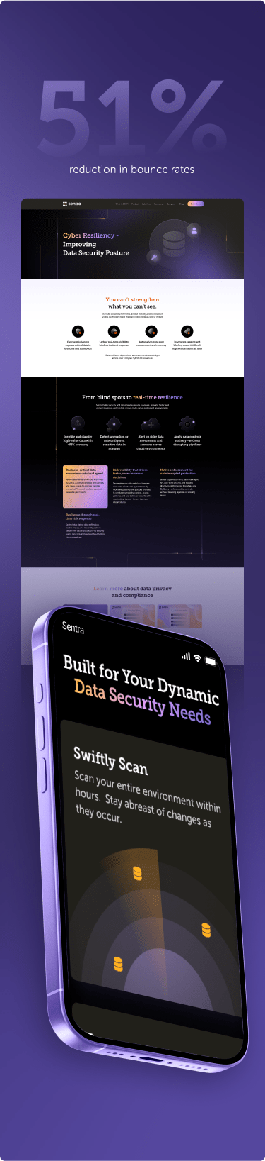
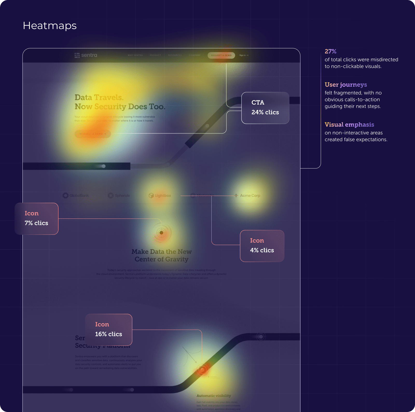
By diving deep into Sentra’s heatmaps, we discovered clear patterns of user frustration. Decorative icons and graphics drew a significant share of clicks, simply because users assumed they were interactive. This invisible barrier turned visual design into a usability trap. Our analysis highlighted key pain points:
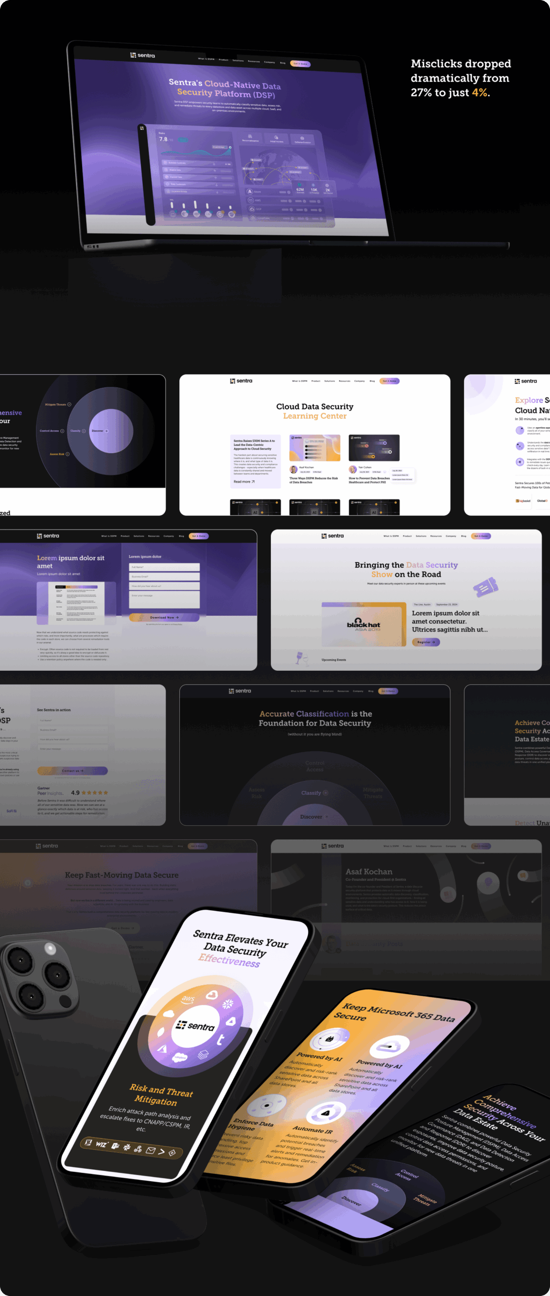
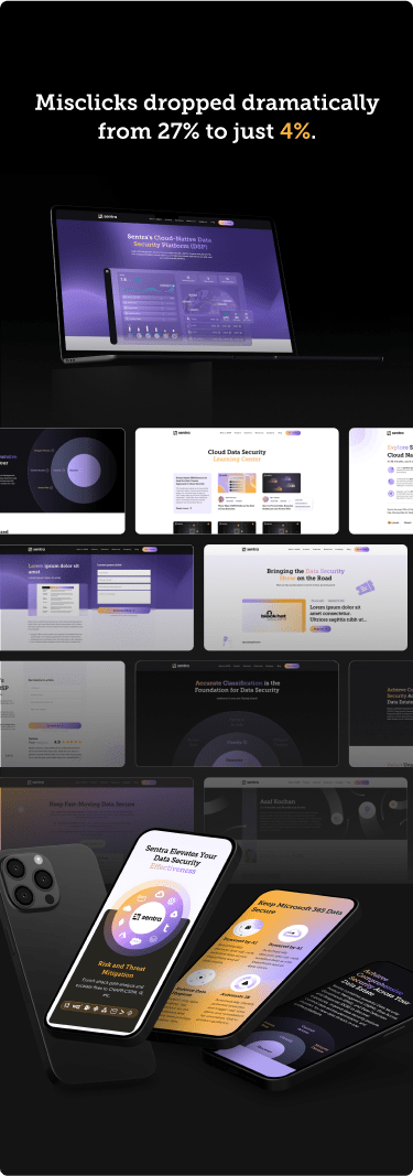
27% of total clicks were misdirected to non-clickable visuals.
User journeys felt fragmented, with no obvious calls-to-action guiding their next steps.
Visual emphasis on non-interactive areas created false expectations.
27% of total clicks were misdirected to non-clickable visuals.
User journeys felt fragmented, with no obvious calls-to-action guiding their next steps.
Visual emphasis on non-interactive areas created false expectations.
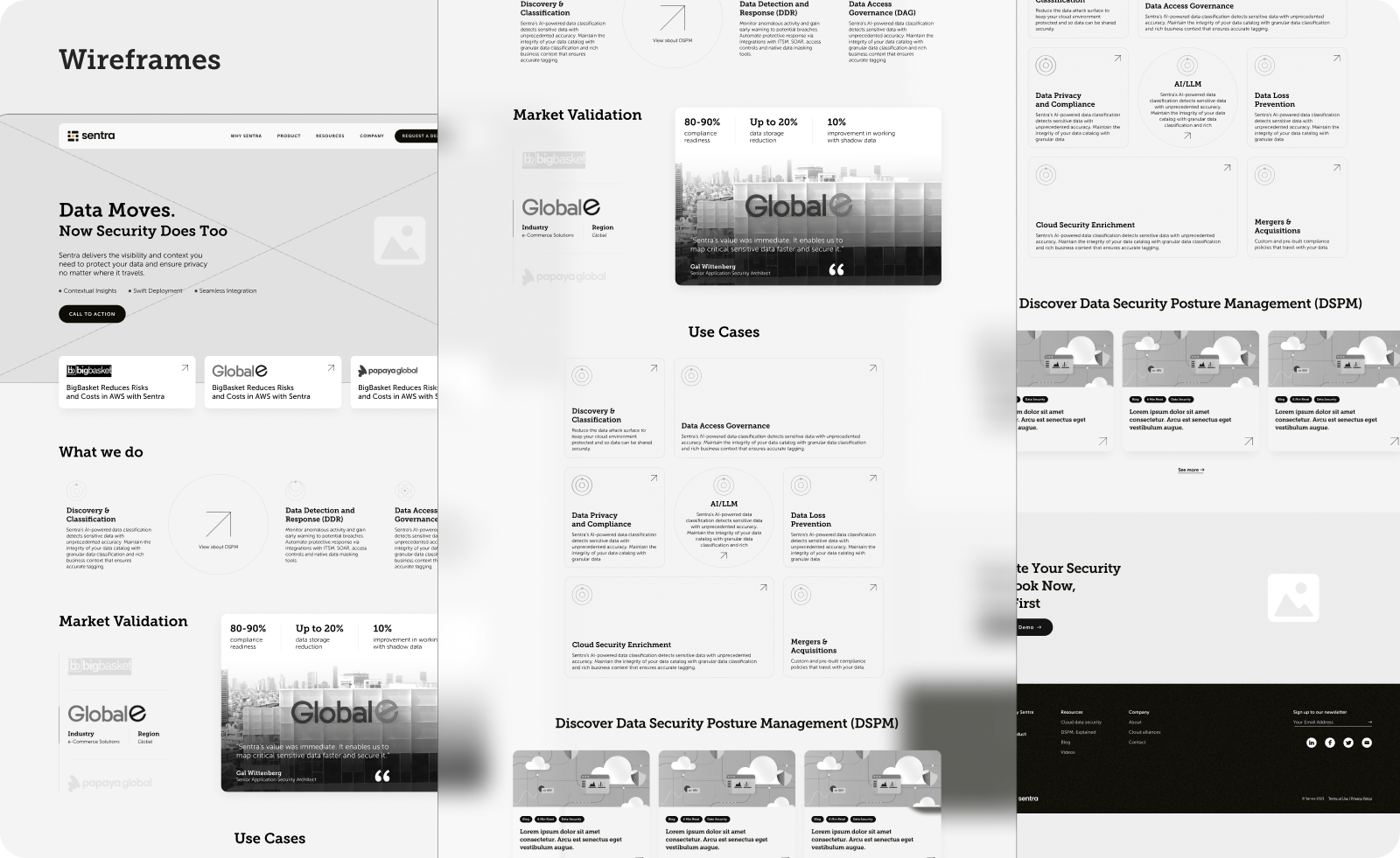
Guided by our research insights, we developed wireframes for key pages that stripped away distractions and clarified the user journey. Each element was positioned with intention, ensuring visitors could navigate seamlessly towards essential information and actions without the guesswork that plagued the previous site.
We brought Centra’s vision to life with a design that blends technological sophistication with modern aesthetics. Lottie animations and scroll-triggered effects added depth and engagement, transforming abstract security concepts into intuitive visual stories. Every interactive element was redesigned to ensure clarity and eliminate accidental clicks.