Dod moshe
Dod Moshe is a leading agricultural brand that connects the field to the plate in the most authentic way. The quality of the produce and its freshness are what give the brand its glorious heritage. Dod Moshe is a symbol of quality for premium agricultural produce, grown by the best and most experienced farmers with decades of experience in the appropriate growing areas. Dod Moshe makes sure to stay connected to the needs of the consumers, to offer excellent agricultural produce to a wide audience and to respond to diverse needs and desires.
Digital
UX Strategy
UI Design
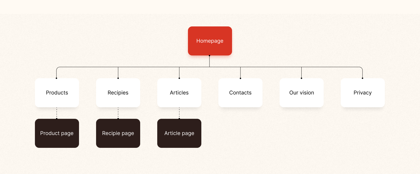
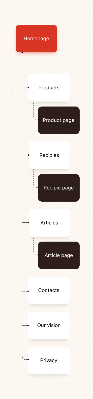
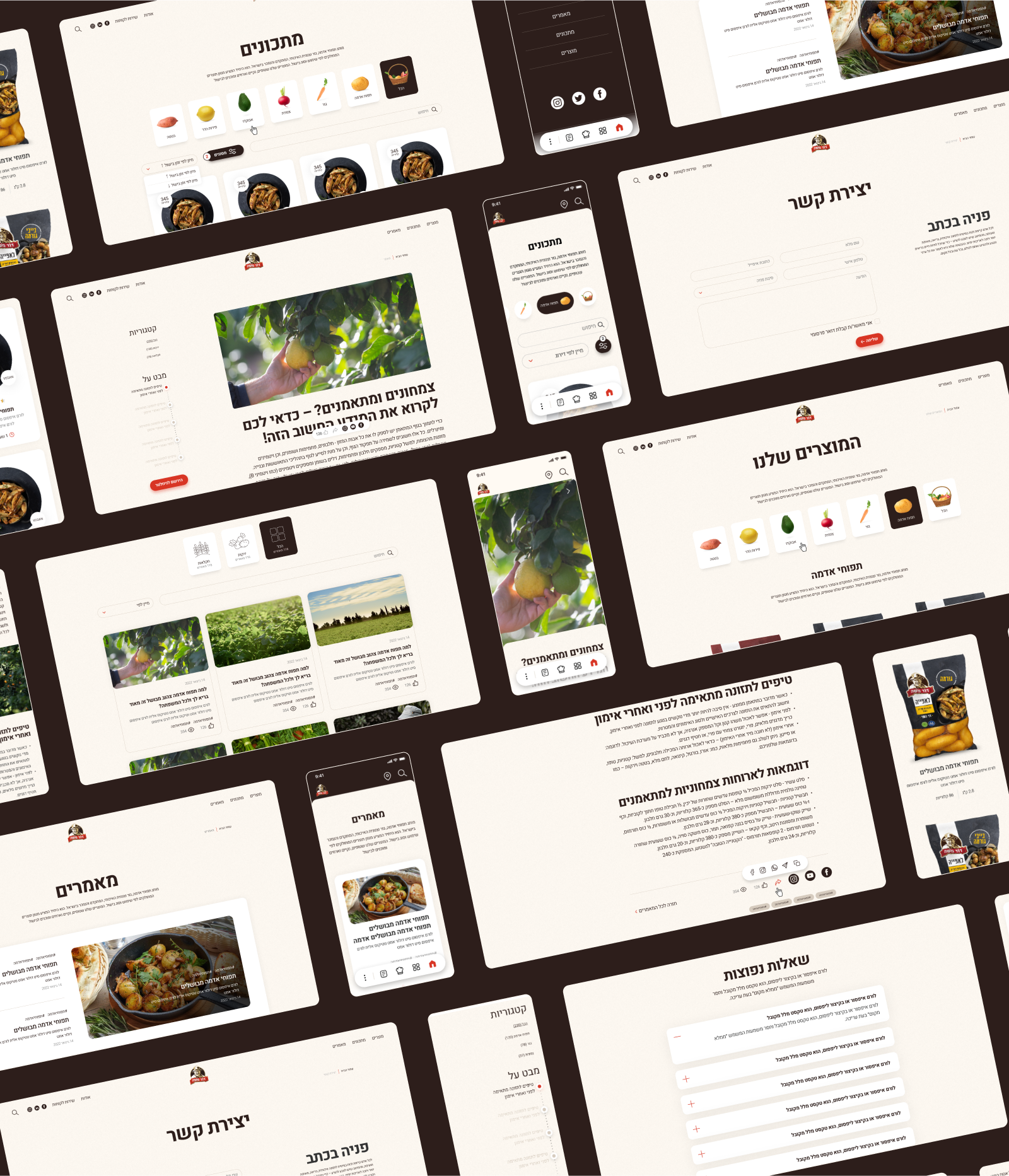
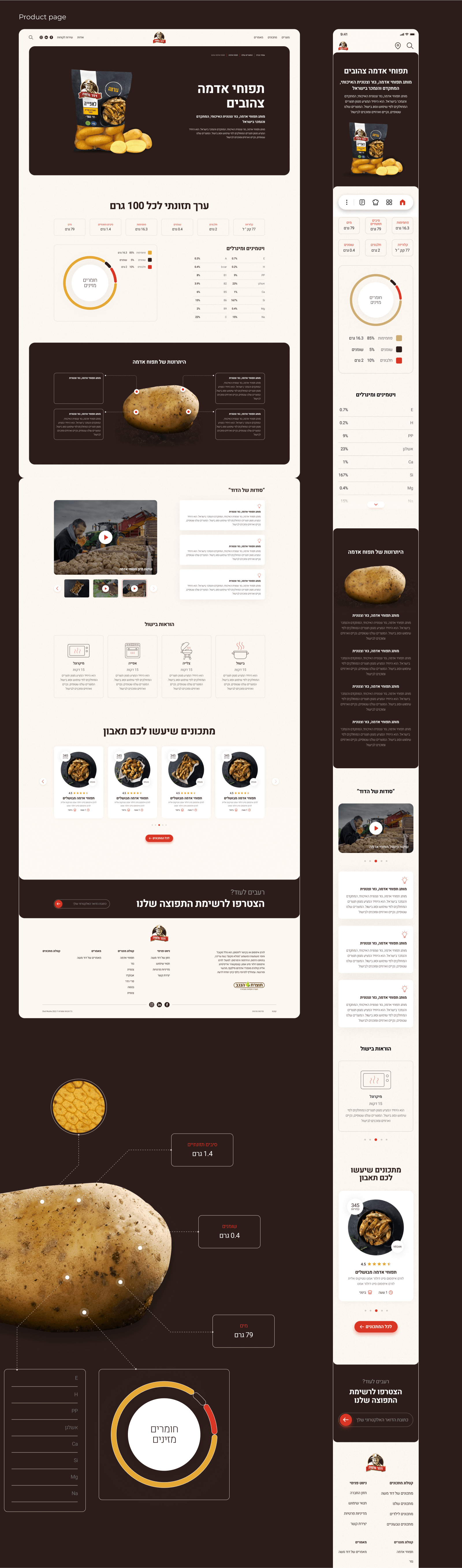
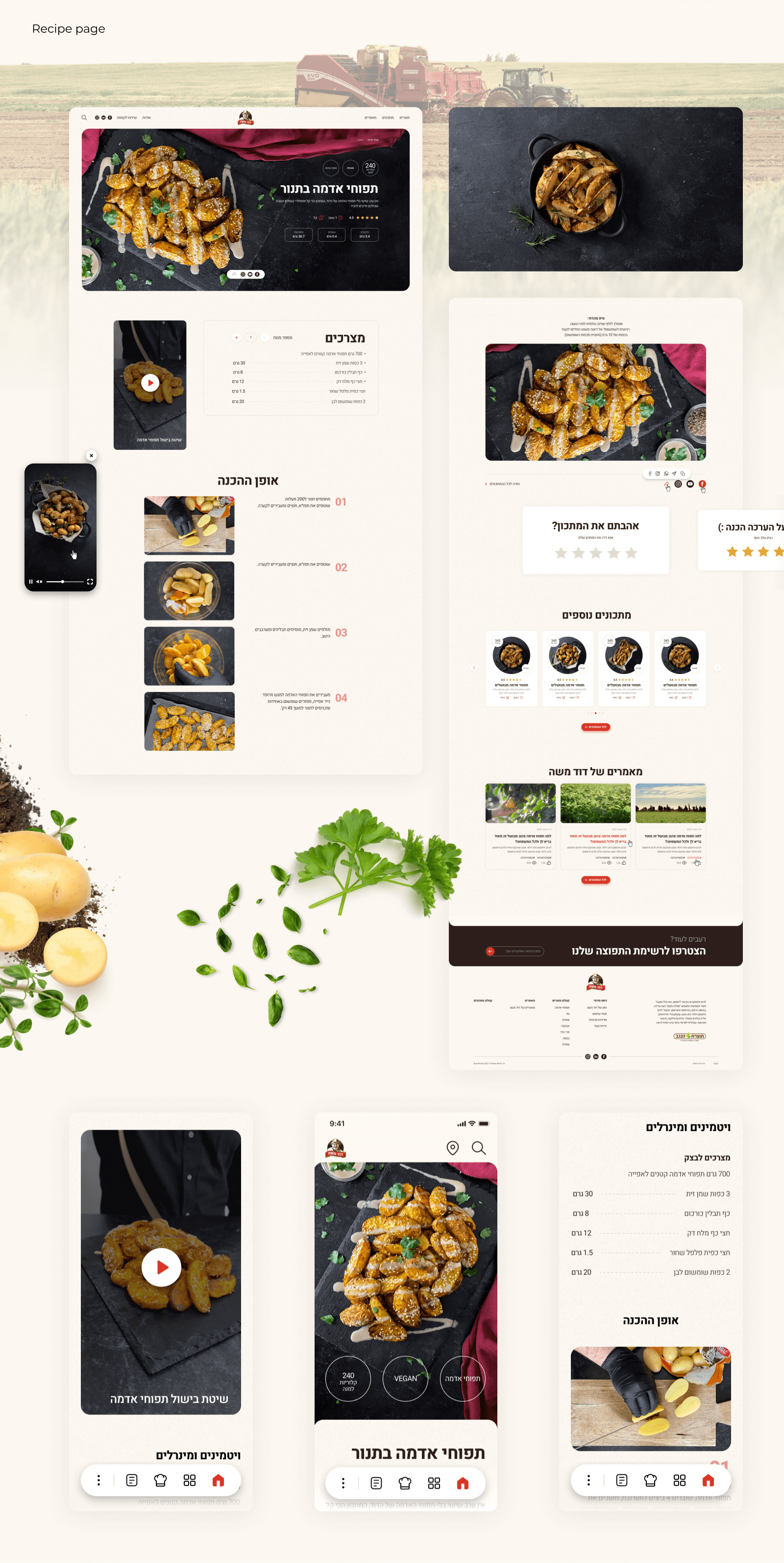
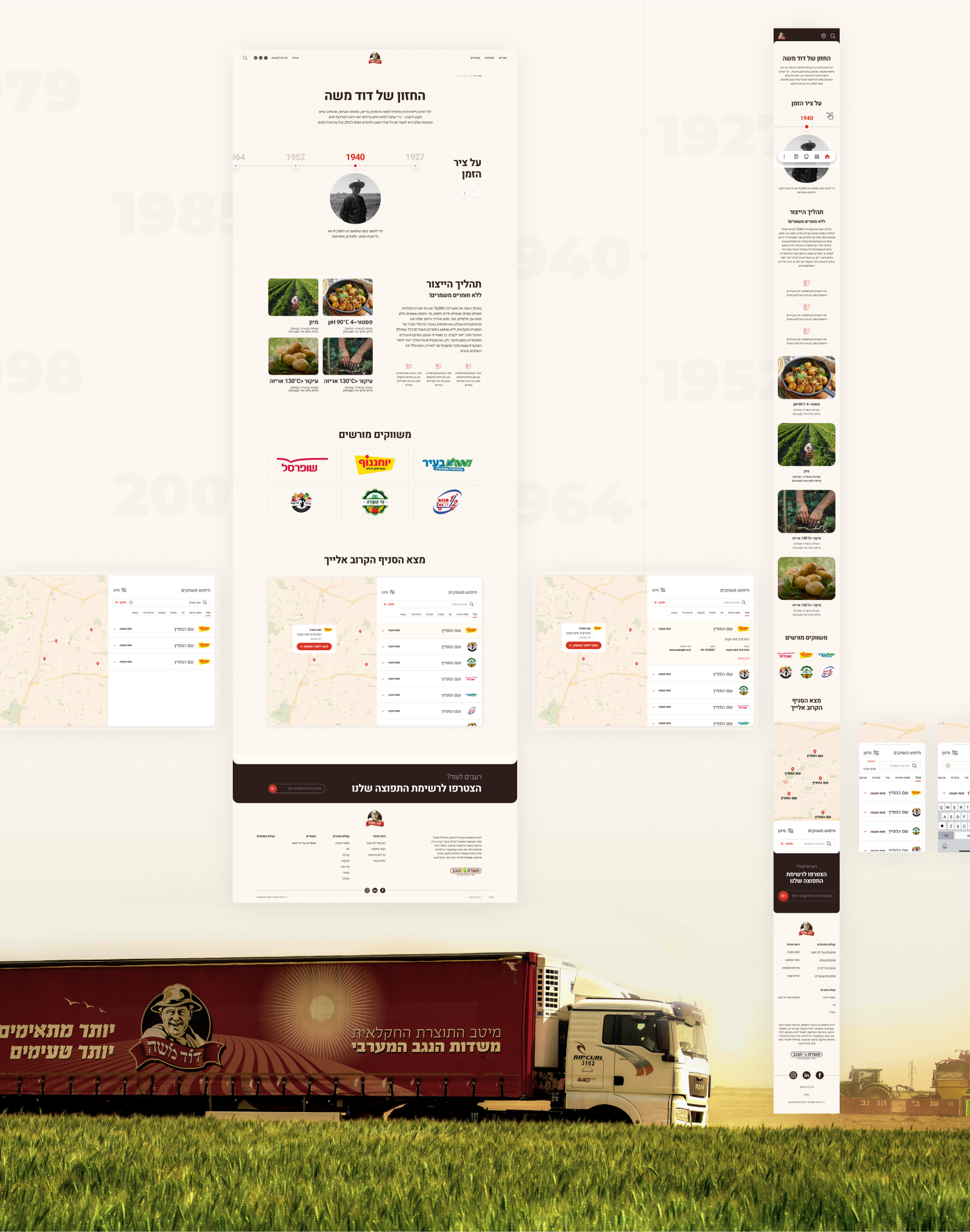
Our team has developed 2 versions of the website design for the company Dod Moshe. The main task was to demonstrate the quality of the products, point out their naturalness and focus on branded recipes using Dod Moshe products
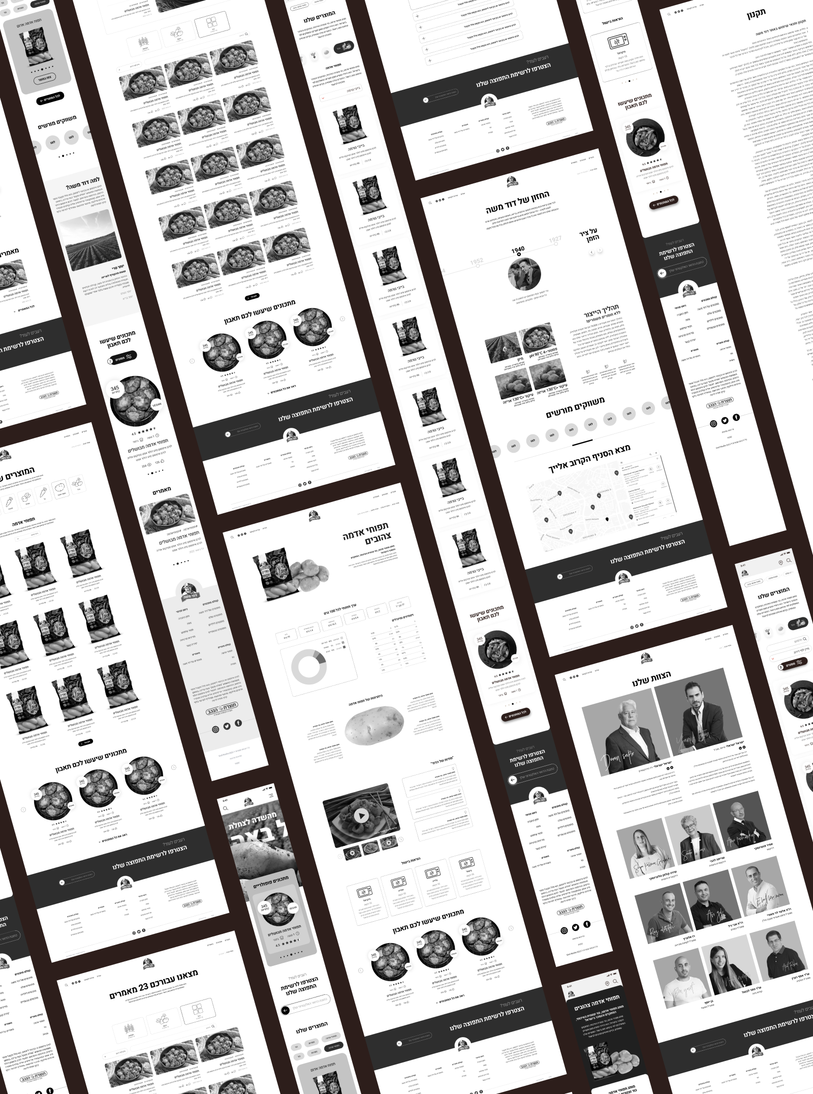
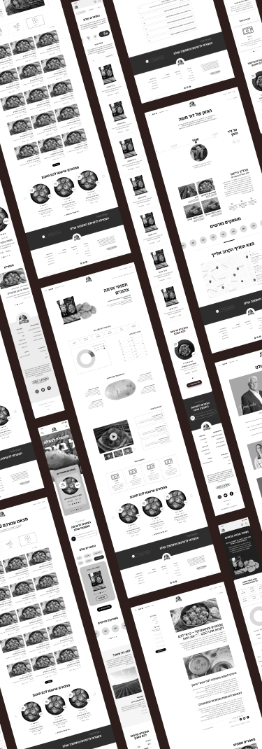
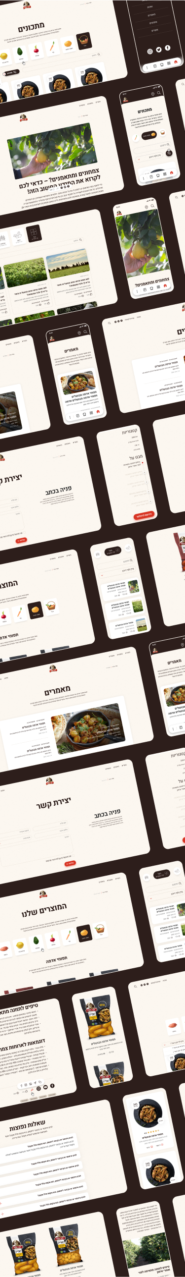
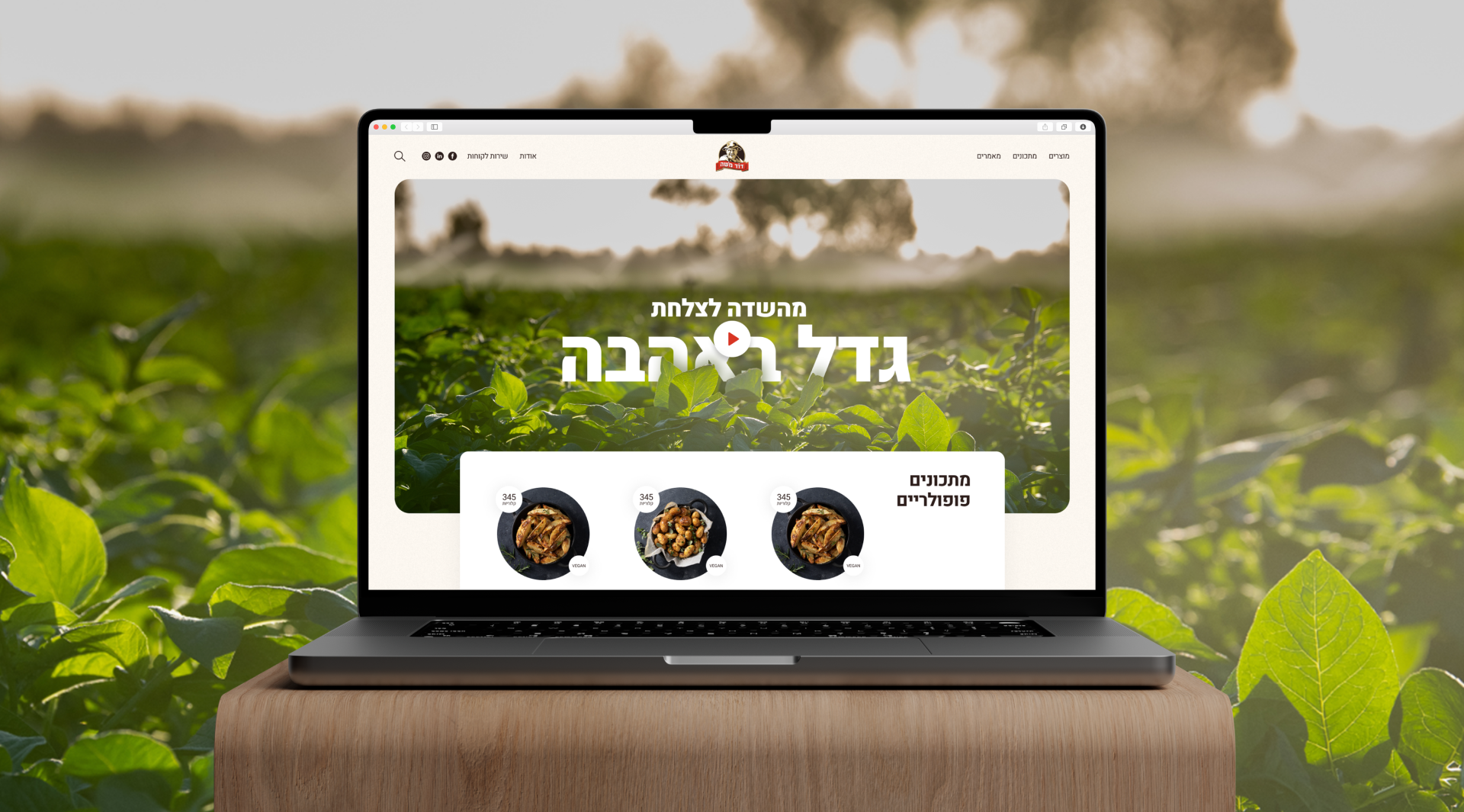
Below is the first version of the website design with magic scrolling and storytelling. The customer decided to abandon this version, as the cost of development went beyond his budget
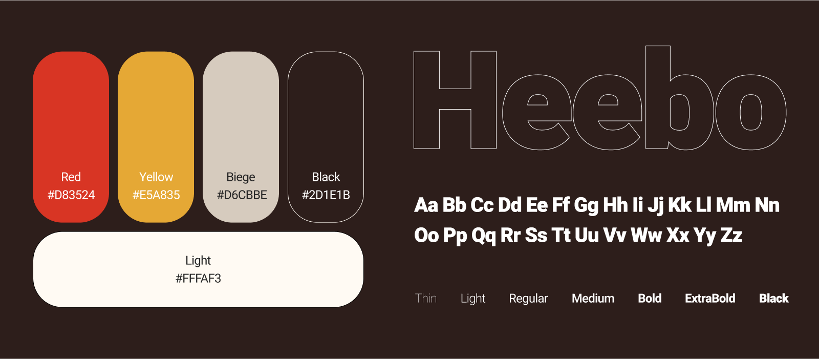
Our team conducted in-depth research to understand the Dod Moshe brand values, target audience and industry trends.
A visually stunning and modern design was created, which corresponds to the corporate style of the Dod Moshe company.
A visually stunning and modern design was created, which corresponds to the corporate style of the Dod Moshe company.
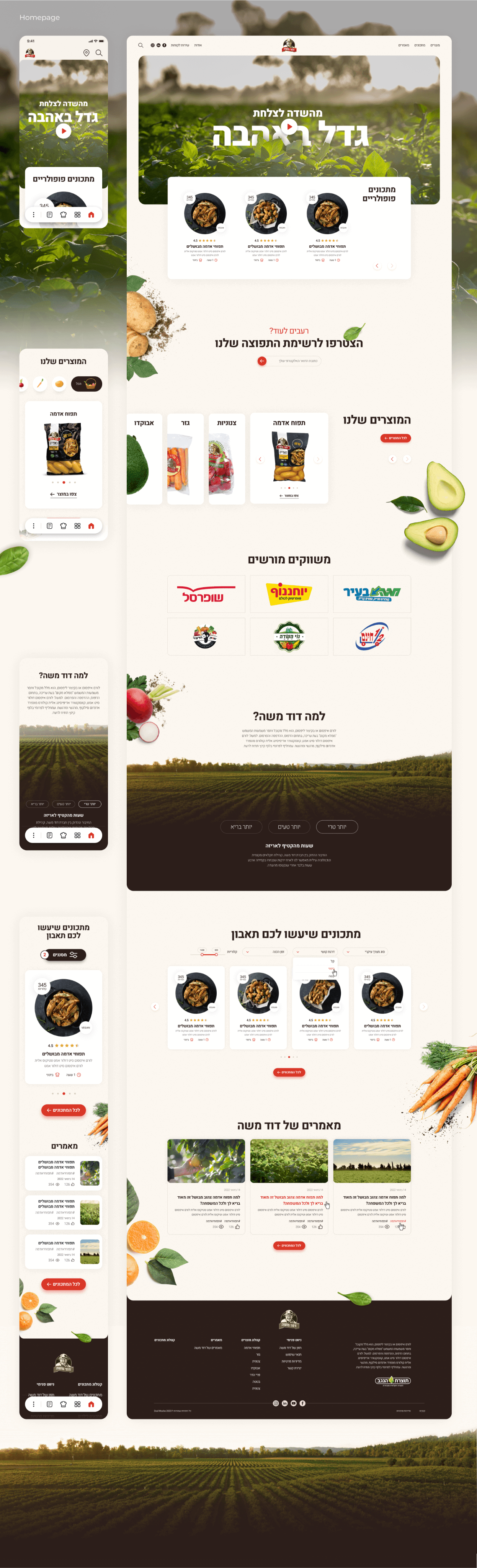


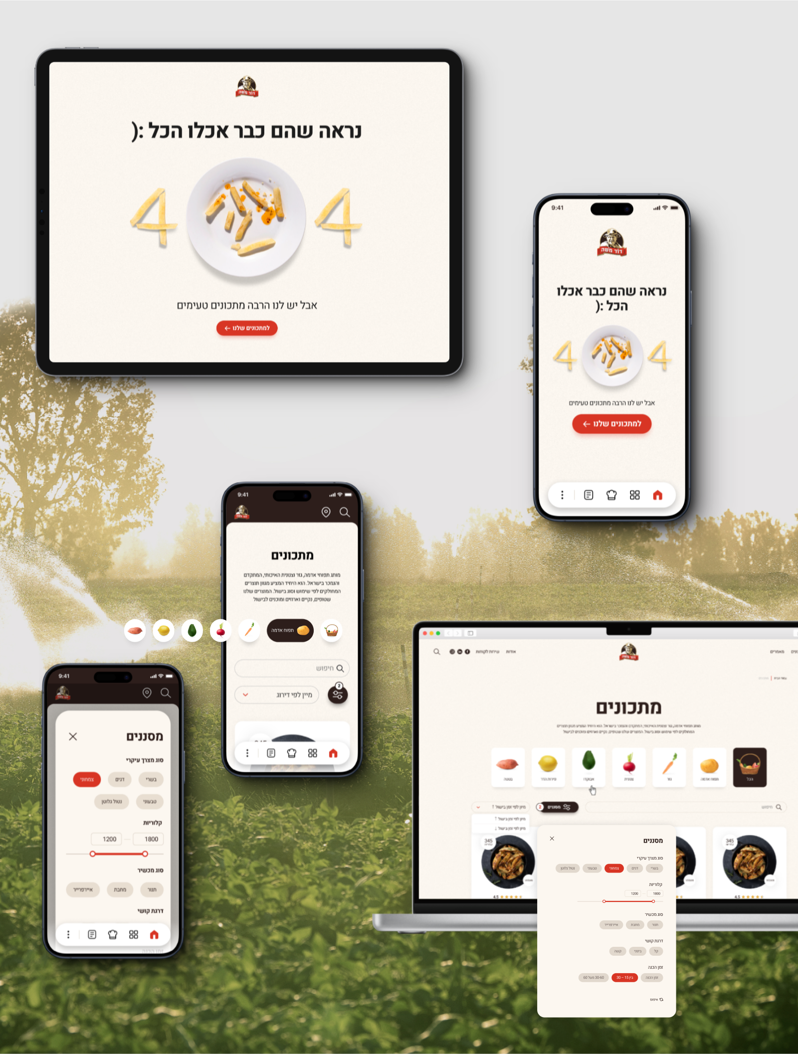
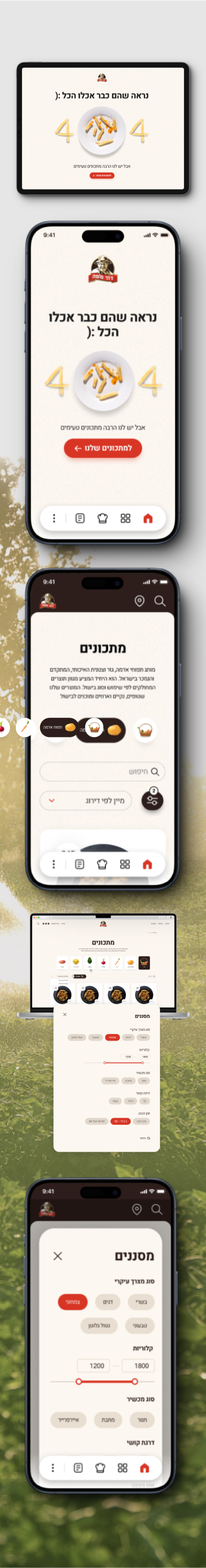
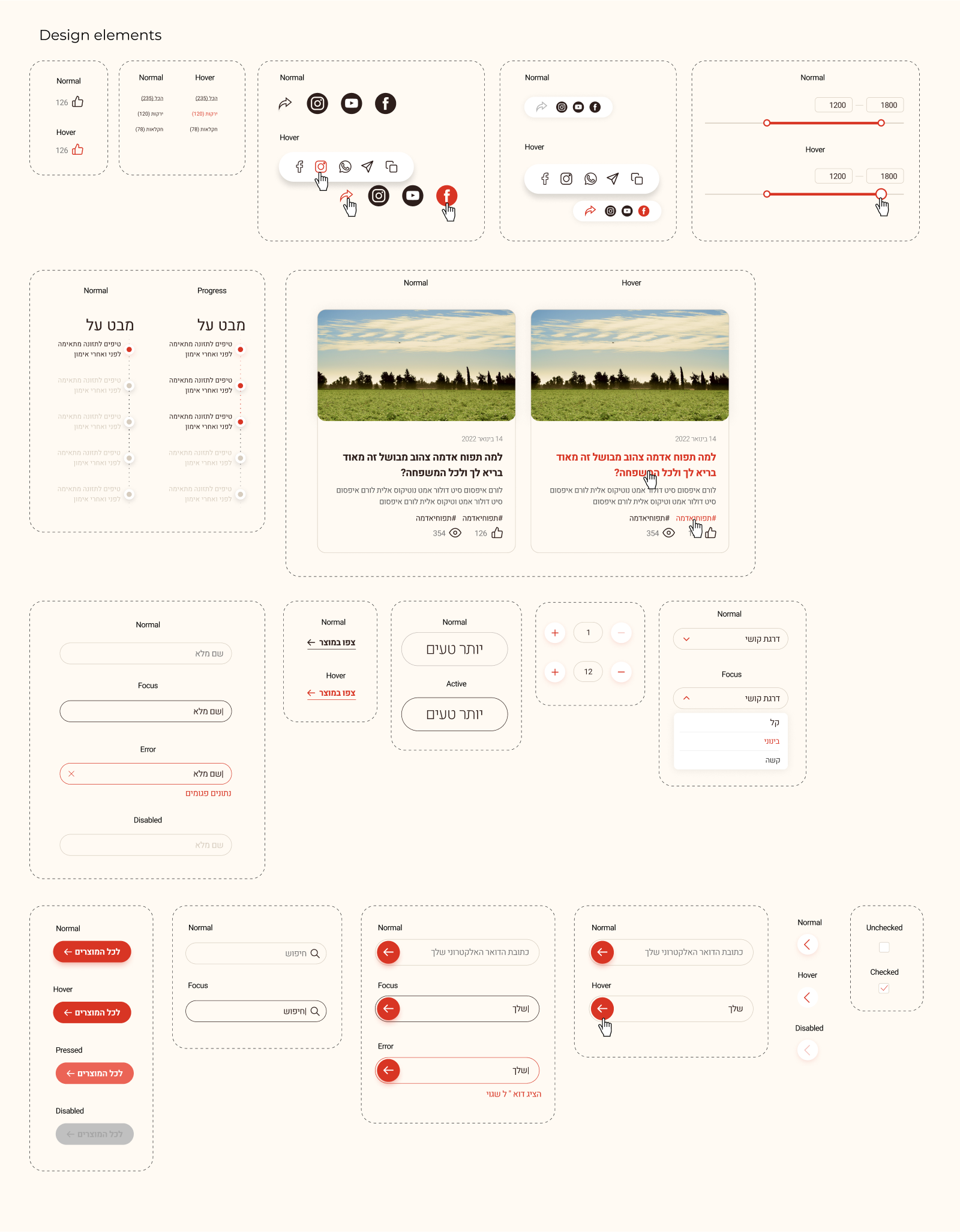
An adaptive design has been implemented to ensure uninterrupted user interaction on various devices.
Built-in intuitive navigation and user-friendly interfaces to increase engagement and reduce bounce rates.
Consistency of tone, messages and corporate identity is ensured throughout the website.
Built-in intuitive navigation and user-friendly interfaces to increase engagement and reduce bounce rates.
Consistency of tone, messages and corporate identity is ensured throughout the website.